
Pretty aesthetics are, truly, wonderful. But they need to go beyond surface-level appeal.
Yup. Your brand colors don’t exist to just look good. They guide attention, reinforce trust and shape how users move through your content.
From email campaigns to ad creative to on-site UX, color is one of the most overlooked levers in brand performance.


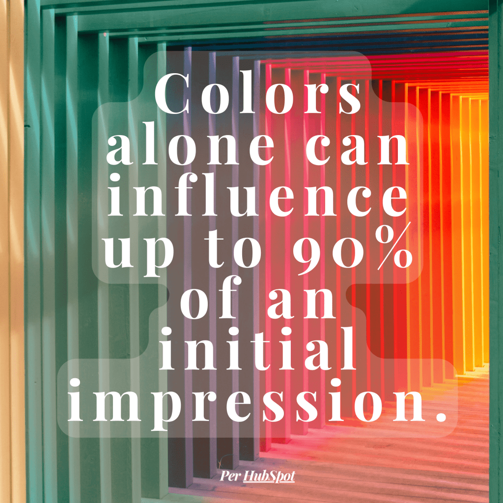
Used well, it’s powerful. Used carelessly, it can chip away at customer trust without you even noticing.
So how do you move from “nice colors” to a palette that actually makes an impact? Let’s break it down.
Color Is Not Decoration—It’s Direction
Buttons that are barely discernible as buttons? That’s what happens when color isn’t doing its job.
Intentional color placement directs the eye and subtly nudges users toward action.
A CTA button that pops against its background can mean the difference between a conversion and a bounce. In email, low-contrast buttons can slip under the mid-skim reading radar.
Headers and footers should also be clearly distinguishable. If everything looks the same, nothing stands out.
Quick fix: Assign roles to colors. Use one for calls to action, another for navigation and a designated tone for supporting text. Also, if you’re reusing templates, double-check that the colors still make sense with your new message!
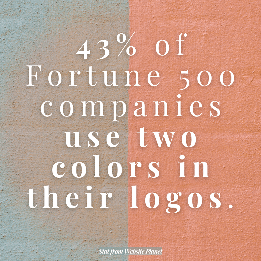
Inconsistency = Instant Distrust
It might seem minor, but mismatched shades across your website, ads and emails can create subconscious friction.
When color use varies by platform or creator, it signals a lack of attention to detail. It also interrupts the flow of your customer’s brand experience.
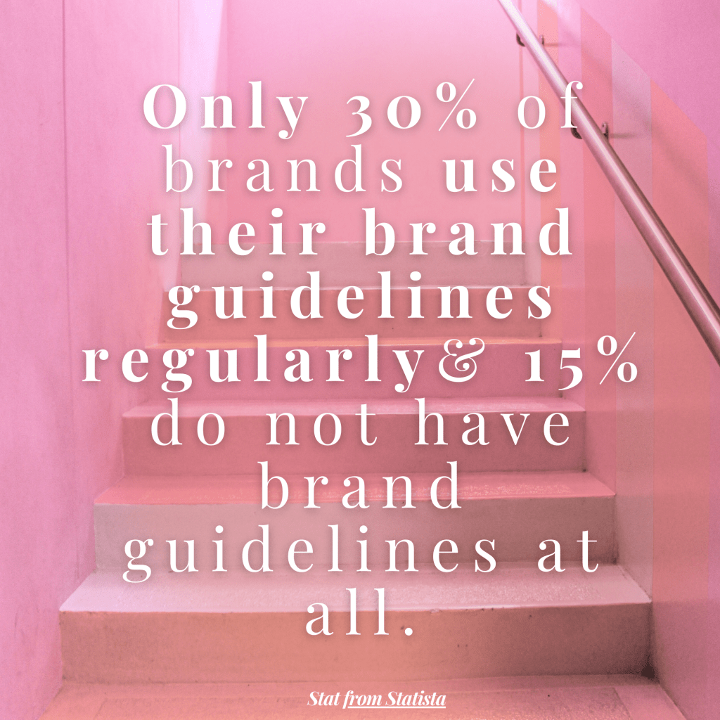
Quick fix: Create a clear, easy-to-share brand color guide. Stick to hex codes, not just vague color names. Make sure freelancers, contractors and AI tools all have access to this. Any changes should be passed along and implemented quickly!
Color Fatigue Is Real
Bold colors are fun—until they’re not. Overusing high-saturation hues like red, orange or neon green can cause visual fatigue and push users away.
Emails and landing pages overloaded with bright tones often feels chaotic, not exciting. Worse, they obscure what matters most; what you are offering.
Quick fix: Generally speaking, use vibrant colors as accents, not a base. Let your layout breathe with softer tones and whitespace. Save the boldness for what really deserves attention. (Otherwise, it becomes a bit of “the boy who cried wolf” situation.)
Different Screens, Different Stories
That blue that looked perfect on your desktop? It might read as purple—or, worse yet, nearly invisible—on a mobile device.
Color rendering shifts across screens, browsers and email clients. If you’re not testing with that in mind, your message may not come across the way you want. Or at all, actually. No one wants to have to WORK to be sold to.
Quick fix: Just like layout testing, color testing shouldn’t be skipped. Preview your emails and web pages on multiple devices and email clients using appropriate tools.
One Brand Color, Multiple Emotions
The same brand color can feel totally different depending on how and where it’s used. That rich forest green on your website might feel earthy and grounded—but on social, it could skew too dark or blend into the feed.
To be clear, it’s not about inventing a new palette for every platform. It’s about flexibility. Think of your core colors as a system, not a set of fixed rules.
One very vital point to also consider is that color meanings are deeply tied to cultural context—and if your brand speaks to an international audience, overlooking that nuance can backfire fast. When possible, localize your color choices just like you would language or imagery.
Quick fix: Build adaptable but defined palettes with light, dark and neutral-friendly pairings. Make sure these colors perform consistently in different environments—and that they are culturally sound.
When to Break the Rules
Is everyone in your industry is sticking with a certain set of colors? While there is likely a reason for this, it isn’t very exciting, is it?
Sometimes, the smartest play is to break from the pack. A powder pink fintech app or a high-end skincare brand wrapped in moody, broody charcoal can disrupt expectations and capture attention.
Quick fix: Look at your competitors’ color schemes. Then do something different…but make sure there is a logic behind your choices.
A Simple Step to Take Today
Revisit your brand color palette. Ask:
◉ Is it being applied consistently across email, social and site content?
◉ Are the right hues being used in the right places?
◉ Does it still reflect who you are and how you want to be seen?
If your answer is “I’m not sure,” that’s a crystal-clear signal to start a color audit. And if you don’t have a brand color palette, create one!
The Bottom Line
The overarching solution? Consider color not as the final polish but as an active part of your game plan.
