
Brands are now often discovered through stories, swipes and sponsored posts. But that doesn’t mean your website should slip by the wayside!
(And don’t even get me started on generational habits—if you’re only optimizing for one age group, you’re probably leaving tons of money on the table.)
It’s your conversion bridge—no matter where or how someone finds you.
How can you strengthen it? What can you do to stand out? Do you maintain it as needed?


Why Keep Your Website in Tip-Top Shape
Here’s why your site still definitely deserves your full attention.
1. You Control the Experience
Algorithms can be reworked completely, feeds can disappear, but your website? That’s yours. No interruptions. No third-party rules. Just you, your audience and the story you want to weave from beginning to end.
2. It’s Where People Expect to Convert
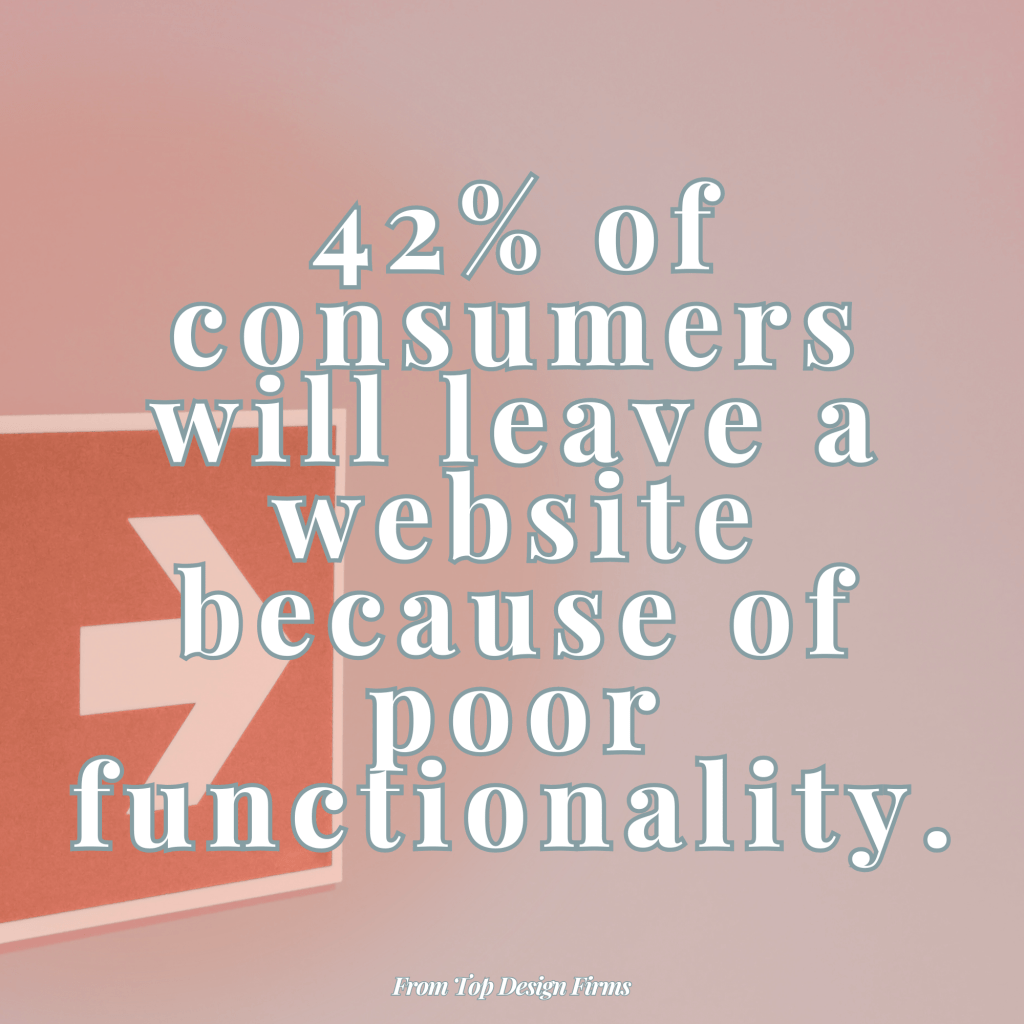
No matter how strong your social or email game is, the moment someone clicks “learn more,” they expect to land on something credible, easy to navigate and aligned with what they just saw.
When they don’t…well, it’s certainly not working in your favor.
3. It Powers Everything Else
Good SEO? That’s your website. Credible PR coverage? They’ll link to your site. Email marketing? It drives people to your site. Ads? Same. It’s the hub—every other channel is the spoke.
7 Super Simple Steps for a Better Site
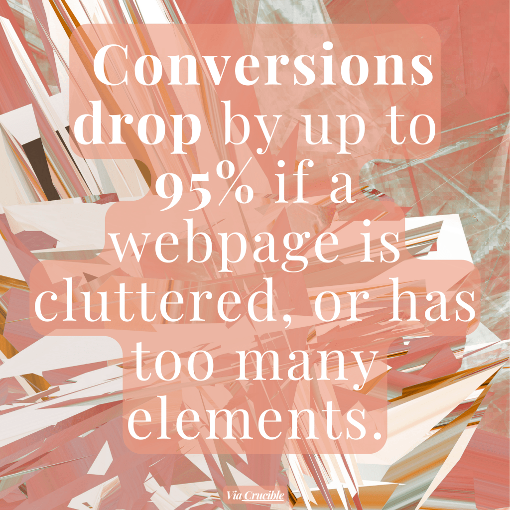
Step 1: Clean Up Your Navigation
Remove rarely clicked items, simplify dropdowns and make sure your top links align with what users are actually looking for. Follow the data and analytics!
Step 2: Update Your Visuals
Swap in recent product photos, lifestyle imagery or illustrations that reflect your current brand style. Even small visual updates can make your site feel more current. Brand colors should be worked in as well.
Step 3: Refine Your Calls to Action
Are your CTAs clear, benefit-driven and well-placed? Replace vague buttons with ones that speak to outcomes.
Step 4: Audit Your Forms
Shorten long forms, remove unnecessary fields and make sure they’re mobile-friendly. People drop off FAST when forms feel tedious.
Step 5: Add or Improve Search Functionality
If your site has a lot of content or products, a smart search bar can improve usability and reduce bounce rates.
Step 6: Check for Accessibility
Make sure fonts are readable, color contrast meets guidelines and all media has alt text.
Step 7: Optimize for AI Search
Your content isn’t just read by humans anymore—it’s being summarized by machines, then shown to your future customers.
Ensure information about your brand is structured, current and complete.
Ready to Go Beyond the Basics?
Let’s talk less “about page” and more impact.
Social Native Landing Pages
Your Instagram feed is sleek and stylish—why does your link-in-bio go to a cluttered menu? Create landing pages that feel like a seamless extension of your social vibe.
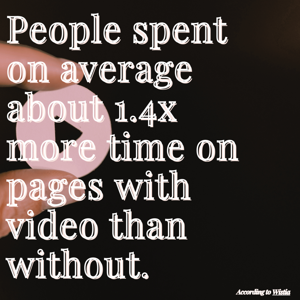
Keep it very visual—with video, too. Keep it scrollable. Keep it cohesive.
These are perfect for bios, DMs, swipe-ups or anywhere you’re meeting users on the go.
Gamified Email Campaigns + Pages
Emails shouldn’t be dull. Ever.
Add interactive elements like quizzes, scratch-to-reveal discounts or progress bars that encourage people to click through to something specific.
Better yet, make that destination count with a custom landing page that matches the email content, not just a generic homepage.
Smarter Data Routing
Your audience isn’t one-size-fits-all. Your site shouldn’t be either.
Use your ad or CRM data to send people to tailored pages based on behavior, location or buyer stage.
For example, cold leads get education, warm leads get conversion paths and returning customers get retention rewards.
Add Dynamic, Real-Time Modules
Nobody wants to visit a digital time capsule. (Especially one that feels like a graveyard rather than a zany blast from the past that could at least collect some nostalgic nods.)
Freshness signals trust. Use live elements like trending products, real-time reviews, updated availability or even countdown timers.
This keeps your site feeling active—even if the core structure doesn’t change often. Just make sure you run regular tests to catch issues as soon as they arise.
Shoppable Galleries & UGC
In many cases, user-generated content (UGC) builds trust faster than polished brand copy ever could.
Create sections on your site, especially on product or landing pages, that showcase customer photos, tagged posts or testimonials. Make them interactive. Make them clickable. Make them pop.
However, you should also do your due diligence when it comes to usage rights, proper credit and FTC disclosure—especially if there’s any gifting or incentive involved.
Build Micro-Hubs or Guided Paths
Create small hubs or journeys based on your audience’s identity or intent (“For Agencies,” “New to This?,” “Need Help Deciding?,” “Shop by Problem,” etc.).
The easier you can make it for people to find what they are seeking, the better.
The Bottom Line
Your website isn’t a passive archive or a one-and-done deal. It’s a core part of the customer journey—often the moment that makes or breaks the entire experience. Give it its due.
